
Avis took a step and met with us in order to make its users experience the digital experience of its mission of being a ‘lovemark’ for its customers. We share the joy of the publication of the project, which we have been continuing with enthusiasm, from user interviews to concept screen designs.
Here is the summary of what we have done …
Defining The UX Strategy
Avis team, as a team that knows its customers very well and cares about their expectations, came to the first meeting with the user experience problems they aimed to solve. We drew a route together to discuss a common UX strategy and shed light on the actions to be taken during the project.
What was the main goal of the Avis team with this project?
- Improving the digital channel experience and reducing call center traffic
What feelings did Avis provide in the real world to its users in the digital environment?
- Confidence
- Perfect Service
Determining UX Research Methods
After the UX Strategy was determined, we set out to plan what we would focus on during the research. We segmented the users and created question sets specific to their expectations. We contacted users with one-on-one user interviews and online surveys, and the very important insights we obtained guided us during the design process.
What does the user want?
“Renting a car is a pleasure for me. For this reason, all the options, details, and opportunities should be clear.”
-A User
#1 Easy and Efficient Use
Based on the feedback of users, it can be said that the main expectation from a car rental website is easy to use. The main expectation was that the data were provided in accurate, clear language, and consistent.
For example; users were waiting to see how much discount they earned by using the discount code, and the total amount was renewed, depending on the rental period selection.
#Assurence Options
Most users said that, based on their overall digital experience, the differences in assurance options were hard to understand.
#3 Rental Durations
Some users wanted to make a quick notification from the website in case the rental period was extended.
#4 Car Comparision
Some users wanted to be able to select and compare the vehicles they would rent.
Concept Design
Some of the basic principles we attach importance to during the design process:
- Good design offers easy navigation to the user.
- Good design shows the answers in the right place at the right time to clear the question marks in their mind without the user having to click anywhere: Does the vehicle model I choose change? What are the additional service fees? What are the assurance options? What are the payment options? …
- Good design is ergonomic design: It does not force the user to make critical choices in tight spaces, it allows the user to interact with the interface in an ergonomic way.
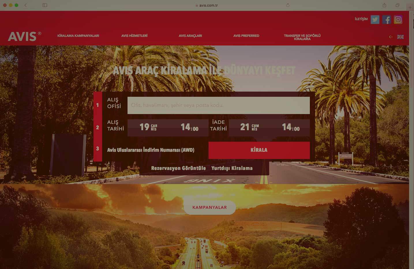
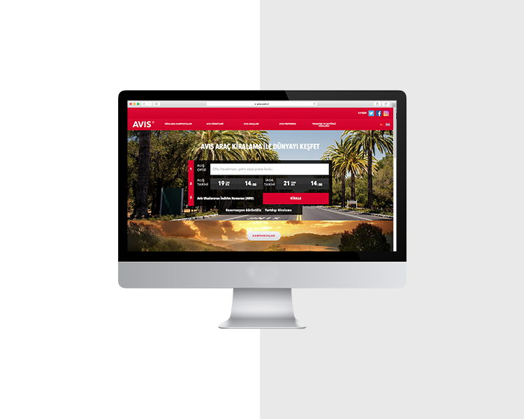
To see the interface we have designed pay avis.com.tr a visit.
