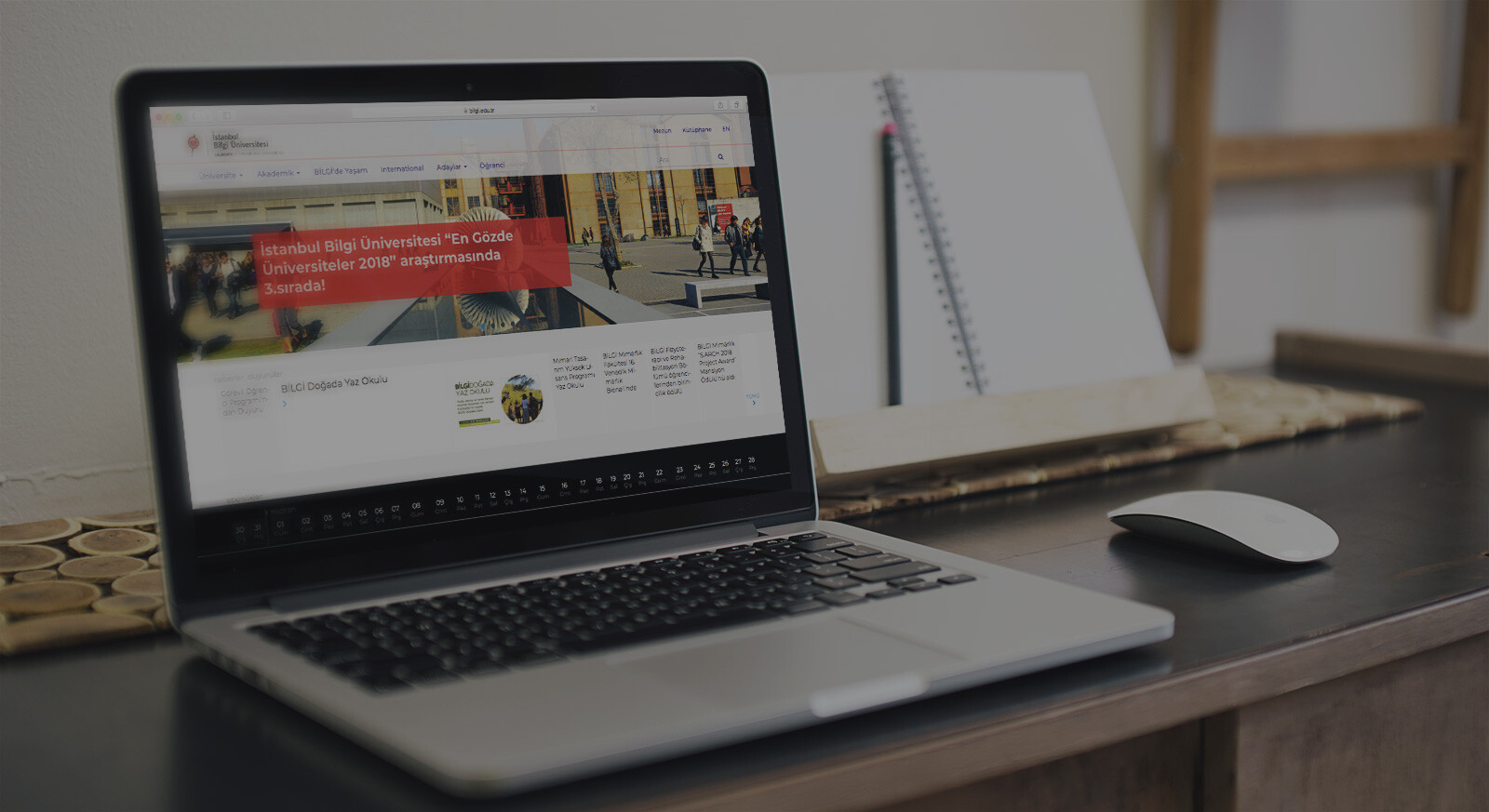
Bilgi University’s website renewal project has been completed, and is live!
In this project, we took part in the design of the user experience up to the information architecture stage under the leadership of the University’s Visual Design team and we share the happiness of having the website live!
In this case study, we wanted to talk about the story of an enjoyable and successful project, full of learning.
Purpose & Objectives of The Project
The main purpose of the project was to ensure that the Bilgi.edu.tr website to be modernized – naturally (!) – was designed in a more user-oriented and usable way for the target users.
However, while doing this, one of the primary goals of the project was to construct the new website as a “hub” and to create a successful navigation on the site where many different user profiles will visit.
Methodology
We determined our methodology and technical set at the beginning of the project in order to carry out the work in the most accurate way.
We applied techniques such as
– Data analysis – Netnographic research
– Contextual interview
– Card sorting
Implementation
We know that the basis for designing the user experience is to develop strategies / concepts based on empathy. With this approach, we carried out the following activities with the support of the University’s Visual Design team.
01. Persona Studies
- Prospective students (domestic, international, undergraduate, associate degree, graduate)
- Current students (domestic, international, undergraduate, associate, graduate)
- Graduate students
- Academics
- Parents
- University staff
02. Insight Research
We interviewed each profile / persona in their own context. Some of the insights we arrived at by synthesizing these interview findings were:
- For university staff, quick access to accurate and satisfactory information was essential.
- The first contact point for foreign student candidates was the website. In their communication with the team, they needed to access satisfactory content from the web instead of prolonged correspondence.
- It was important for all stakeholders to be able to reflect the culture, values and opportunities of the university.
- The purpose and motivation of using the website for current students and prospective students were very different from each other.
- The most different behavior pattern among all these profiles was followed by the parents.
“Now, think of Bilgi University as a human being,” we said at a workshop with prospective high school students.
“You have 5 minutes to chat and ask questions, what would you ask?”
Their answers to the question also guided us.
03. Scope Study
With the data we obtained as a result of the research, we presented the content strategy according to the answers given to the question of “what kind of website should it be”. We determined the homepage messages of the website.
04. Bilgi Mimarisi Tasarımı
As a result of our scope work, some of the goals we set while setting up the new information architecture design were as follows:
- To ensure the visibility of the events at the university.
- To provide an environment where faculty and department pages can reflect their own worlds.
- To ensure that foreign students can quickly access the information they are looking for.
Result
We explained the final information architecture design to all relevant units and handed it over to the Visual Design team for implementation. We have enjoyed the experience that the new site that went live is much more successful from the usability perspective.
As UXservices Team, we would like to extend our thanks and congratulations to Bilgi University Visual Design team members Burak Yetgin, Emrah Gürkan, Nevzat Arı and Tarık Kavaz for their support in the study.


